What up guys! The last week has been pretty busy. What with our dear friend the plague of Flu 2.0 shutting down everything involving more than 4 people in the same room, I’ve been frantically mailing everyone I’ve been chatting to about contract work to see how losing out on pitching time is affecting their plans.
Still, I’ve been managing to find time to grow my own abilities. In the last two weeks I focused on my digital art abilities, or lack thereof. The result? I have a long way to go. Even so, I thought it would be good to humiliate myself and share my efforts with you lovely people!
The Logo
So, when learning to do something new, you should practice with something of little consequence, and not use your creations until you are competent enough to do a good job. So naturally I chose to learn by creating my logo; the face of my brand, the first thing people will see on my social web.
I am not a smart man.
The first few attempts were amateurish at best, and I admit, I tried to cut corners. I used a font, wrote the company name, and played around with it:
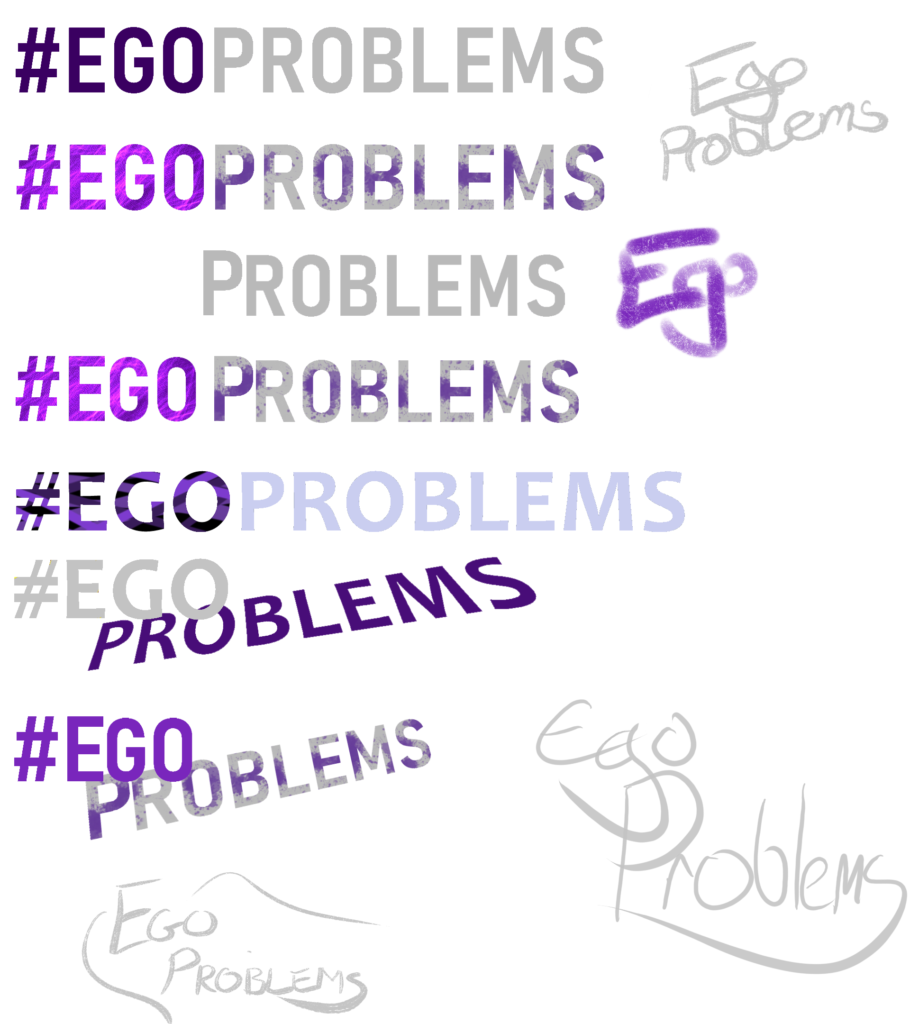
Not great. The fourth one was probably the best of those, so I gave it a try:
But it didn’t feel right. I thought long and hard about what the problem was and came to two separate conclusions: It looked too much like a business rather than a games studio, and it didn’t really say anything about the brand.
Back to the drawing board.
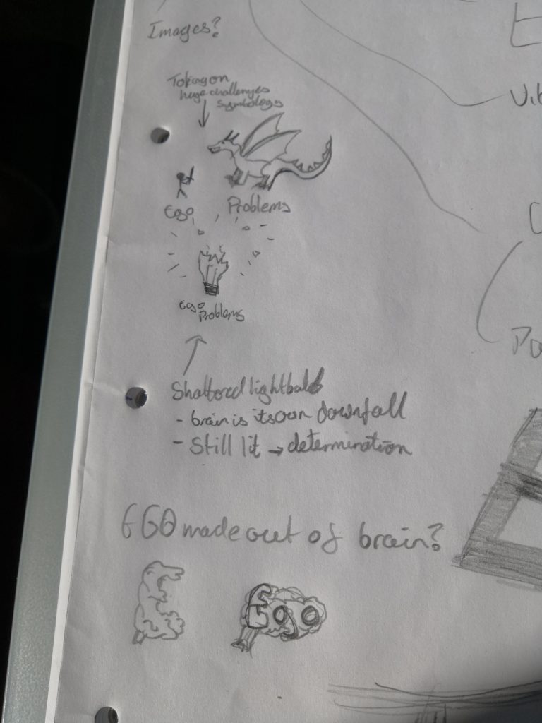
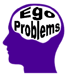
After some very rough sketches, complete with pretentious thought processes to boot, I landed upon using the brain as a core piece of my logo. Thus began the second wave of logo creation:
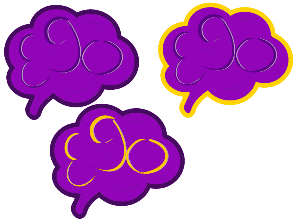
I persisted with this for a little while, and am even now quite pleased with what I created. I added the problems using regular old text:
I still wasn’t happy though. The font just didn’t work, whichever font I tried, and as proud as I was, the “Ego” just didn’t pop out at you; it was easy to miss.
Enter my other half, Suzie. She threw together an image of the words inside the profile of a head. Something clicked for me. Instead of putting the words into a brain, make the words be the brain popping out of an exploding head. Brilliant. All credit there goes to her. I didn’t want a profile shot though, and the image she sent was silhouetted. It looked too business-like. I started playing around.
It was also at this point that I discovered Krita. It is excellent. Up to this point I had been using Sketchbook. But Krita seems much more feature rich, has great documentation, and seems to have good ethics too! I recommend giving it a try, and dropping a few quid their way to support them.
This isn’t sponsored by the way, it’s just really good software that I think deserves the support!
Back to the logos. I did a quick draft in about 30 seconds:
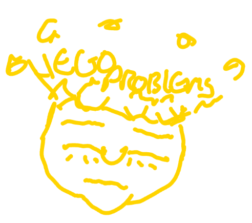
And I liked the concept. It was relevant to the brand, not too clinical, and eye catching. Well, as eye catching as a yellow scribble could be. I tried again:
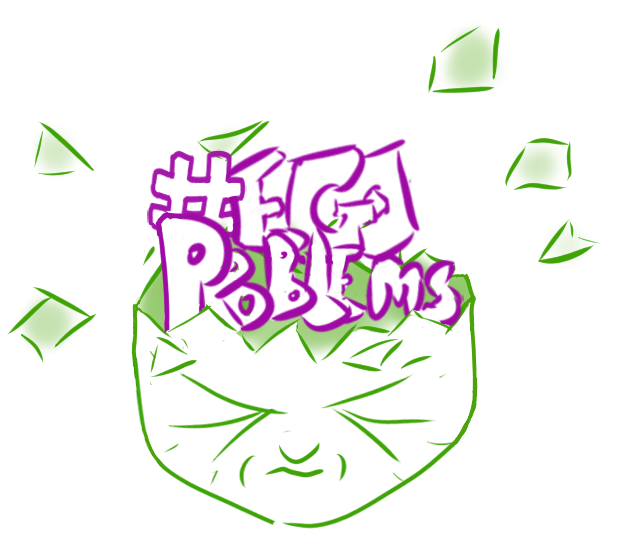
Getting somewhere… The face didn’t scream ego though. So I honed some more:
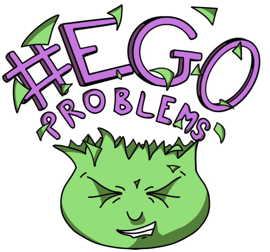
I added some colour and made the text quite punky. At my housemate’s suggestion I swapped a single line grin for teeth. I liked this a lot. Enough that I passed it on to a friend with actual talent, to make it better (or to make something completely different. If she had a better idea, I was all ears).
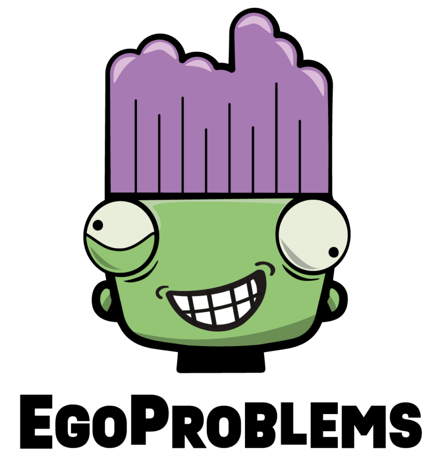
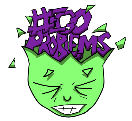
Then I fiddled some more. Hey, it’s all practice right? Anyway, this logo looked very 90s punk, and the text isn’t the easiest to read; it’s a bit dark. So I made the colours a bit more pastel-y, and rounded the face off a bit, and had a fairly decent take three:
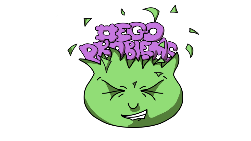
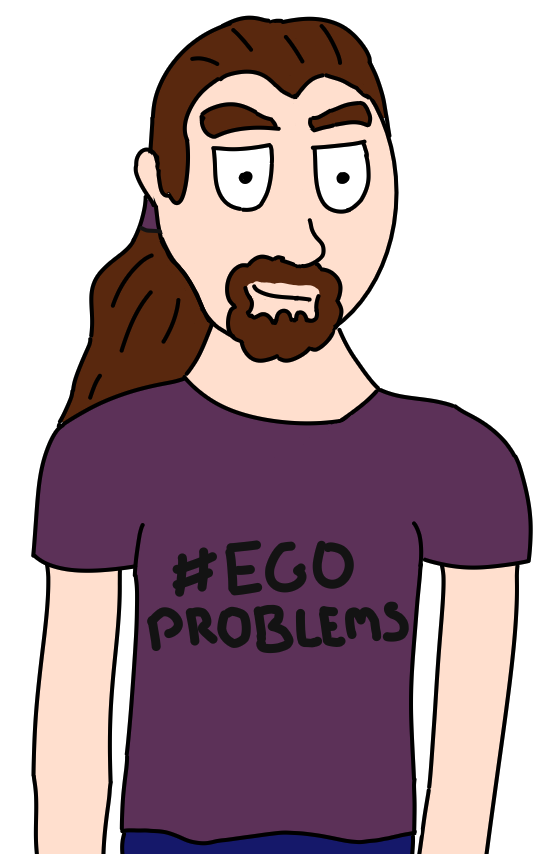
I was very pleased with this. Enough that I was willing to use it as placeholder while I wait for the competent person to do a better job. A couple of people told me the text was too hard to read though, and in fairness, it probably shouldn’t be so small relative to the face. So I played around one last time:
And this is where we are now. I would still change a few things; the text isn’t there yet, and the shading is amateurish. But I fixed the jagged edge on the right so it follows the grain, the text is bigger than the head, and it’s easy to read. For now, it will do. I’m still waiting for my competent friend to get back to me. I’m looking forward to seeing what she comes up with!
More Practice
So how else have I been practicing? Well, what better way to practice and boost my ego at the same time, than by doing some self-portraits! I started by really trying to get the key features of my face right. And failed.
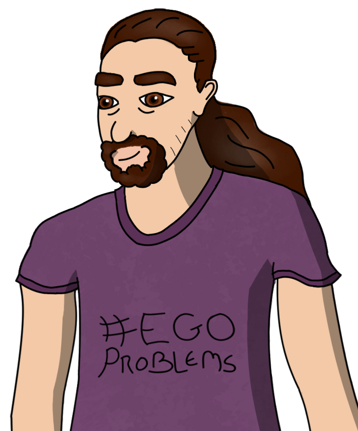
It’s me. Ish. The eyes are way too big, the face a bit too long, and for some reason I am sans chin. But it was good practice. Next I tried tooning myself up a bit, emphasising key features. This is the result:
I like this guy. He’s my favorite of my attempts. In case it isn’t obvious, I have a bit of a goatee and gigantic eyebrows. You can probably also tell that I have put zero effort into the torsos on any of these as should be apparent by the floating left arm; seriously, where is that supposed to be attached? It’s in the car park while I’m buying all the hand sanitiser on the planet across the road! Torsos are for a different day. And don’t even talk to me about muscle structure.
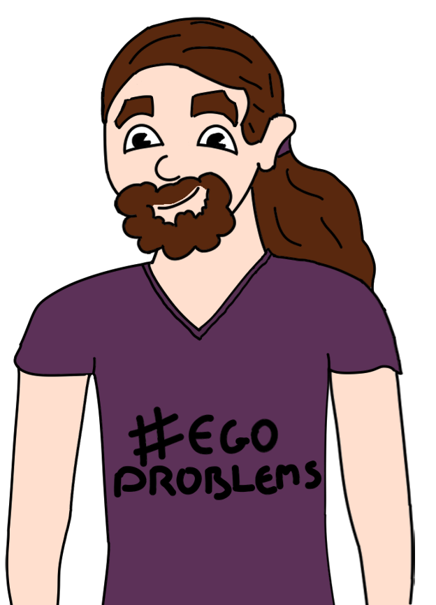
Next up: A speed draw. Me in 10 minutes. That’s not a lot of time for my skill level, whatever Drawfee and whoever else on YouTube may think!
Result:
I am aware that I am getting whiter with each drawing. It’s a direct result of time spent in front of the PC, I assure you. For a 10 minute drawing, I was happy with this. I got the goatee, and the eyebrows, even bulged the nose so it’s closer to its hideous actual.
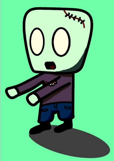
And finally, as a bit of fun, and a tribute to the days I used to read My Own Genie in the Dandy, me in roughly that art style in 5 minutes:

If I truly copied that style I would be a lot stumpier, and my hands giant! But it’s close.
So that has been my art journey over the past couple of weeks. I should probably stick to programming, but I am certainly improving. My hope is that if I need to, I can put a thought on a page and show it to someone so they can use it as a starting point for real art!
What do you think? If you have a favourite drawing, call it out in the comments, if you have your own art journey, share it! We’d love to hear from you! Til next time!
Matt out.
Bonus
Still here? Ok then, here’s a sneak peek at some early concepting for our mobile game. Guess what it’s about!
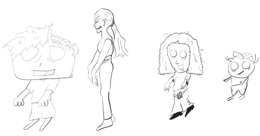
More details to come soon!
Matt out for real this time.
One thought on “Art Antics: Learning to Draw”